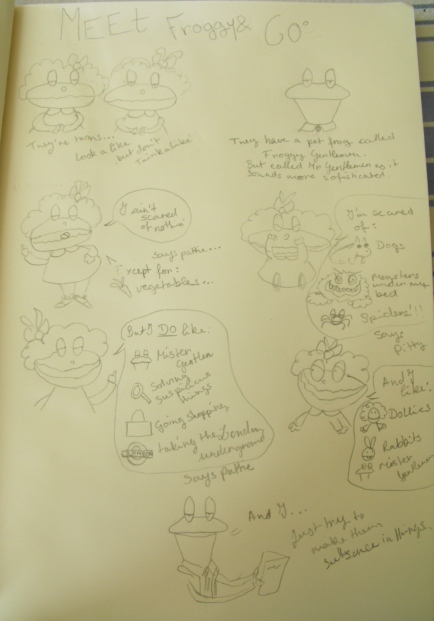
As always, when I find new artist I try imitate their style. I uploaded an illustration app on my Ipad and started doodling. Here are some of my trials:
Sunday, 21 October 2012
My Ipad doodles
For my adorn and decorate unit of GCSE art I chose to do fashion illustrations of Valentino's dresses in SS12. I had to look at various artists such as the young and new Niki Pilkington and the legendary David Downton to inspire my work. As I follow D2G Apparel's facebook page, which is a website focusing on up and coming fashion illustration, I could discover a range of talented and original artists. One of the artists was Mustafa Soydan: Digital vs. traditional illustrations: Mustafa Soydan says both caught my eye with this beautiful illustration of Kate Moss for French Vogue:

Tuesday, 24 July 2012
Stina Persson illustration...
Stina Persson is an amazingly talented illustrator from Sweden. She works with lots of different media such as watercolours, photography, ink ect...
here are some of my favourites:
They are both modern (as she uses Adobe photoshop) and vintage at the same time which creates a uniqueness...
here are some of my favourites:
Wednesday, 27 June 2012
School sketchbook
Line drawing of myself...
Collage..
Mixed media: crayons, oil pastel, watercolours and copic markers...
In the style of Norman Rockwell...
I left Paul McCartney with no black like I did for John as I liked the contrast of the facial features with the white... but my teacher wanted me to do it for John so I could see the effect...
Mr. Todd from the Wind in the Willows...
Tuesday, 26 June 2012
Today's work
A sketch of Edie Campbell.
close-up
Monday, 25 June 2012
Leigh Viner illustration...
As I was searching for illustration blogs to get inspiration I found Leigh Viner's blog: CREATE. What I love the most about her illustration is that, even though it is quite contemporary, it is very classic.
This is my favorite. I love the hair as it reminds me of Klaus Voorman's Beatles Revolver cover. The dark eye, contrasting with the light pink lines fits in beautifully.
For those two, I like the effect of the paint dripping.
The brushstroke in this one is very elegant, giving a light effect.
Sunday, 24 June 2012
Subscribe to:
Comments (Atom)

.JPG)
.JPG)
.JPG)
.JPG)


